


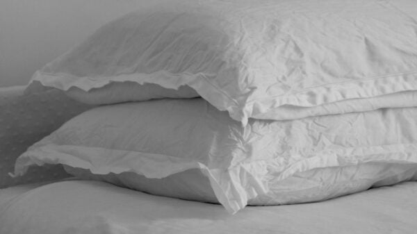


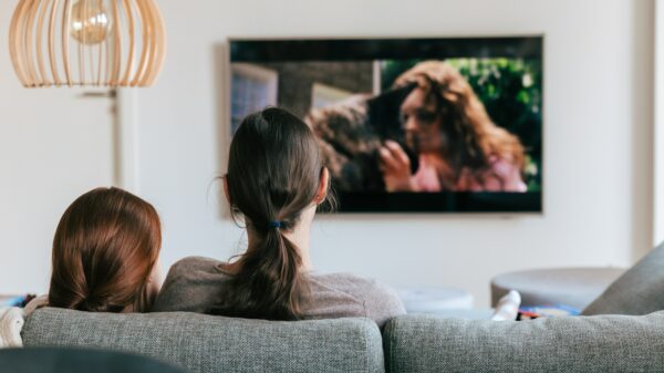
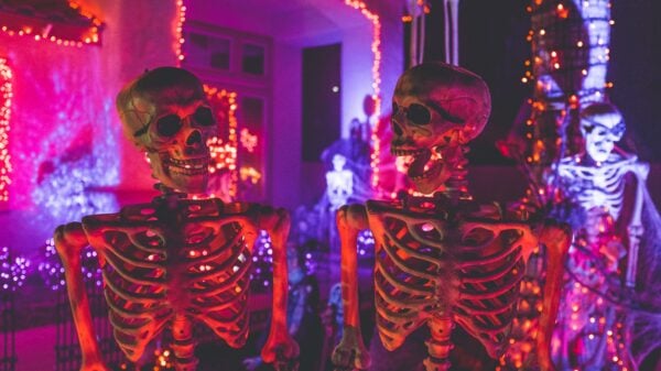


Ever sauntered into a room which hugged you like a warm sherpa blanket or, quite contrarily, felt like pacing around a frosty igloo? Now, tell me – would you believe if I said the wallpaper behind those emotions was merely the way colors danced around your surroundings? Well, lads and ladies, believe it or not, the tints, shades, and tones in your dwelling can choreograph quite an emotional ballet!
As mortal goddesses navigating the human realm (I mean, us women), we possess the uncanny knack for curating comfy-cozy corners that echo our nuanced individuality. Weaving the magic wand of colors into this equation amplifies the story our spaces narrate.
But hold on, put down your shield! Despite the rainbow of possibilities being borderline frightening, think of it as strolling through a candy-aisle – overwhelming yet thrilling. We’re here to douse the anticipation with a little wink and a nudge in the right direction. We’ll not just dive into the enchanting world of colors in home design and their eerie influence on our moods but also serve some tried-and-tested tips for concocting a color scheme that mirrors your unique charm and employs accents to add layers of visual allure. Wait till we’re done, coz by then, we guarantee you’ll possess the secret sauce to elevate your home decor using colors and imprint your essence within every nook & cranny.
Masterclass 101: Psychology of Color in Home Design
When redecorating your space, remember to slip into your resident psychology hat. Why? To understand the subtle yet seismic impact of hues on mood swings and atmosphere. Ta-da! Welcome to the captivating confluence of color symbolism and interior decoration.
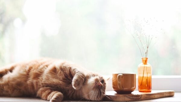
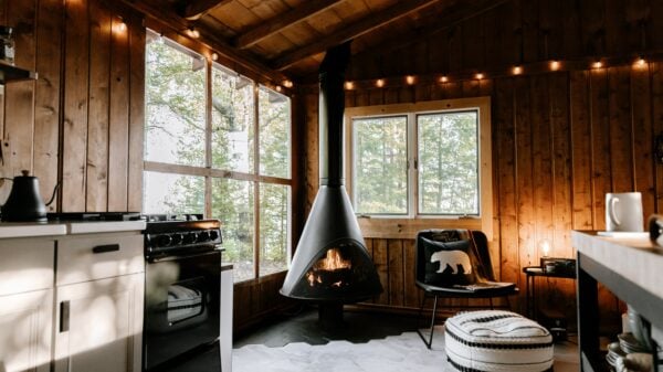
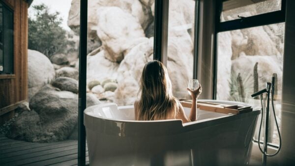
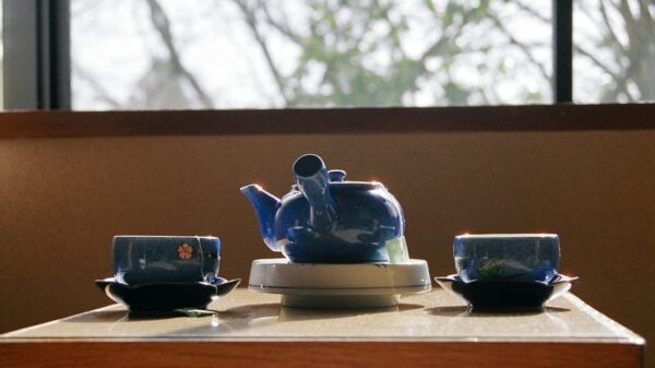
Just imagine the color blue, doesn’t it feel like sipping a cool sundowner on a breezy beach? That’s precisely why it’s synonymous with calmness and tranquility – perfect for boudoirs or retreat corners. In contrast, picture red – the spicy, zesty salsa dance queen. Yeah, well, it resonates with energy and passion – ideal for shared spaces pulsating with spirited conversation.
Color trends might spin faster than vinyl records on a vintage turntable involved in interior design; however, colors remain the eternal maestro – harmonizing any space into a symphony of warmth and welcome. Some may play it safe with beige or gray while others go all out with jewel-tones like emerald green or vivacious mustard yellow – ultimately, it’s about sipping tea from your cup of comfort.
Just like a perfect afternoon tea blended with your favorite flavor infused with eclectic infusions around, understanding color psychology lets you chalk out an environment that is a true reflection of you and even serves as an emotional bolster.
Illuminating Your Space: Picking the Perfect Color Scheme
Now let’s shift gears to talk about picking that perfect blend of hues that’ll have your space singing your praises. Pivotal to not just visual harmony but emotional equilibrium too is color psychology (yeah, it’s back!). Thus, your chosen color scheme bears weighty significance.
Think about current trending colors (you want to stay updated), but let your canvas be painted with hues that make your heart hum. Don’t worry about fitting into the trendy Tetris if it feels alien. Find joy in experimentation – mixing different shades & tones till you stumble upon that sweet spot tethered to your personality yet radiating hospitality for guests.
With the perfect color scheme as your sidekick, ready yourself to concoct not just eye-candy aesthetics but an ambiance that feels like coming home.
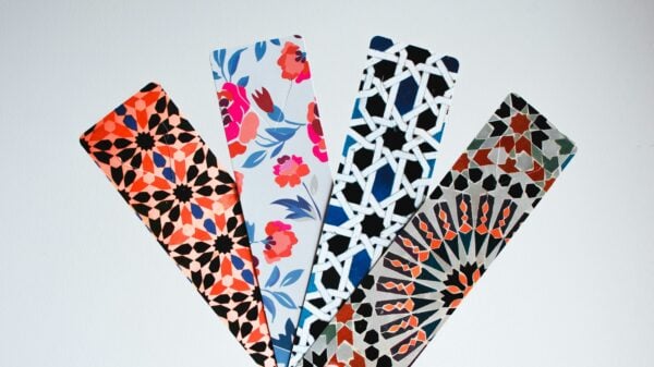
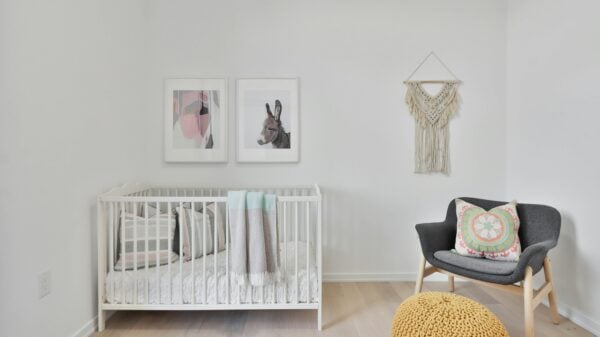
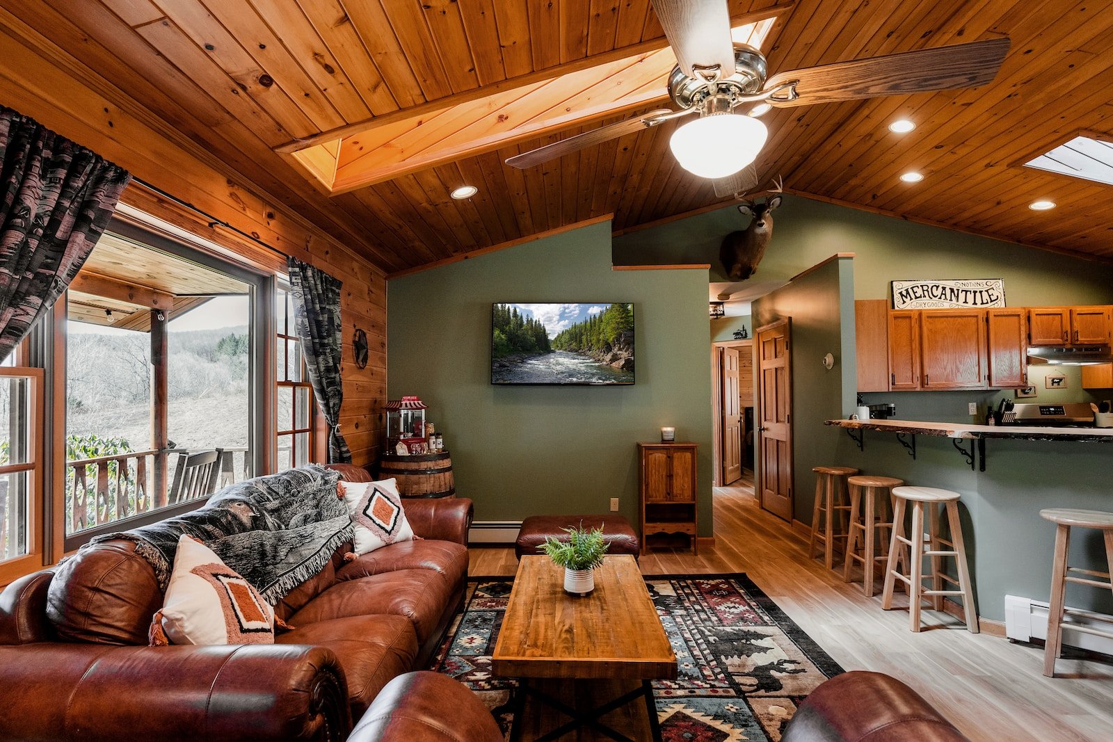
Adding Dollops of Interest with Accent Colors and Patterns
All set to stir in some life into your living space? Insert accent colors and patterns stage left! They play crucial roles as jazzed up extras against the main leads in your home decoration soiree. It’s like pairing a classic LBD with an eye-popping scarlet lip – neutral base with an intrigued twist.
Pepper in patterns such as stripes or polka dots across accessories like throw pillows or curtains for adding textural curiosity. How about throwing some spotlight on fabulous architectural features at home? Paint them in opposing shades to enhance their beauty and center stage- them as focal points.
Not only will this amplify their architectural gravitas, but also whip up an attention-stealing point in the room. A clever utilization of accent colors and patterns dotted across your home decor tapestry means carving out a notch of individuality in your style quotient.
Painting Charm Through Textiles and Accessories
As you put final touches to your refreshed dwelling don’t skip on sprinkling personal charm via textiles & accessories. They are like pavlova toppings – sweet little finishers making everything just delectable.
Texture and contrast – these happen to be the two magic words when it comes to layering colors via textiles. Engage in fabric match-making involving various textures like velvet, wool or linen and see how they add dimensions to your interior design story.
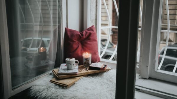
Throw pillows are probably the easiest (and my favorite) route to incorporate smidgens of color and texture. Pick diverse patterns like stripes or floral prints for a playful vibe. To increase visual depth choose different fabrics for each pillow cover. Also, be a bit audacious with bold shades – they can lead your room from drab to fab!
Lastly, complete the look by scattering select decorative elements like vases candles and framed art pieces that jive with your color framework.
Striking A Balance: Ensuring Cohesion With Color
Harmony and balance lie at heart when designing a cohesive look that whistles your personal style tune. Remember your school art classes featuring color wheels? Time to dust off those memories!
Comprehending how colors communicate can aid you in weaving together warm & cool shades rendering an intentional symphony of harmony. Kick-start by choosing primary color(s) for the space then twirl over to the color wheel for complementing shades sitting right opposite your dominant hues – gosh, isn’t this akin to finding soul mates!
A cozy huddle of these warm & cool tones will establish immersive depth & appeal while maintaining visual composure. Remind yourself to ground bold bursts with neutral sidekicks like serene white or chic beige also doubling up as backdrops for brighter counterparts.
Follow these pro-tips & confidently venture forth creating a home decor palette singing odes to you!